

Well, this has turned into a bit of a series hasn’t it? And why not! A brilliant beer label always adds an extra element of pleasure to my drinking experience (and, er, as I’ve run out of space in the cupboard I’ve had to create a gallery of beers on the side, so I’d quite like them to look nice thank you very much).
The next rebrand I’m looking at is organic real ale producer, Stroud Brewery, who has recently updated and refreshed its packaging.
Stroud Brewery specialises in producing organic cask ales. Their core range includes their pale ale, amber bitter, stout and lager, but they also brew seasonal ales throughout the year. Most of the range is cask conditioned (if you’re into that sort of thing), but they also produce kegged beer, cans and bottles too (if you’re into THAT sort of thing).
They’ve come up with a new modern look, designed to communicate the brewery’s core values; ‘sustainability, ethical buying and the British palate’.
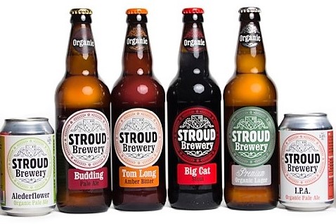
Each bottle has been given a brightly coloured label, with a concise description of the ale on the front of the bottle (note: I think this is important, particularly when new beer drinkers have such a huge selection to choose from and may not fully understand the differences between a real ale and a crafty banger) and a strong artisan feel.
Ultimately, this is a well executed concept and a sensible and solid evolution of their previous labels. The strong colours give them shelf standout (loving Big Cat!) and I think they convey the brewery’s commitment to organic beer and a premium product. Perhaps not the most exciting rebrand in the world, but definitely a successful one (besides, not everyone can be as dramatic as me eh?)
