

Happy St Piran’s Day! Wow, it just comes around quicker every year. For those of you unaware of St Piran’s Day; it’s the national day of people in Cornwall. So, to celebrate, I’m going to talk about the Skinner’s rebrand as, a year on, I’m still finding the ‘new’ labels just as delightful.
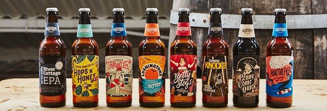
Well, where do I start? Skinner’s have done an incredible job, creating a set of labels that are exciting and diverse, but that still clearly link together as a core range.
That diversity comes from Skinner’s making the decision to work with six different artists to develop a new look for each beer:
- Cornish Trawler’s tattoo inspired design was illustrated by Alex T Frazer, whose experience includes working with many musical artists including Mogwai, The Drowning Men and Ben Folds Five.
- Cornish Knocker was reimagined by Joe McLaren, an artist who has worked widely in newspapers and publishing, illustrating the work of Terry Pratchett, Lewis Carroll, Charlotte Bronte, George Orwell, Charles Dickens, Andrew Motion and John Betjeman.
- Hops ‘n’ Honey’s look came from the pen of Rose Forshall, whose work has graced such diverse canvases as The Times, the Port Eliot Festival, Waitrose, Garden Illustrated, Anthropologie and Baker Tom.
- Stevie Gee, an underground artist who has designed for Paul Smith, Vans, Penguin and the Archie Bronson Outfit, captured Porthleven’s spirit.
- Lushingtons’ beautiful label was created by ASide, a dynamic Cornwall based team of illustrators that have worked with pioneering brands such as Origins Coffee Roasters, Dorset Cereals and the Port Eliot Festival.
- Penny Come Quick’s artist Chris Odgers is an illustrator and fine artist who’s tackled everything from album covers and graphic novels to large scale wall installations and commissions from private collectors.
- Last, but not least, Nick Beringer brought new life to the classic Betty Stogs design. Nick has been a key partner for Skinner’s since the brewery’s inception.
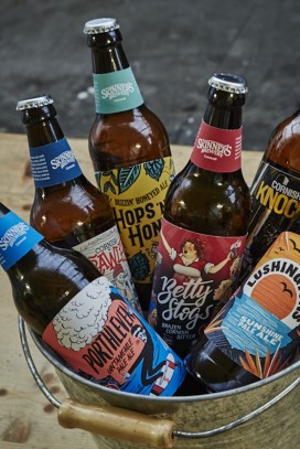
My favourite? To drink – Betty, always. To look at – Hops & Honey. I just love the vibrant colours, the cheeky little bees, and the contrast in the colours of the labels on the body and bottle neck.
THIS is how you rebrand. THIS is how you modernise your brand while staying true to your core values. THIS is how you retain your core drinkers while also attracting a new, younger audience. And THIS is how you make real ale just that little bit cooler (which, by the way, it totally is).
