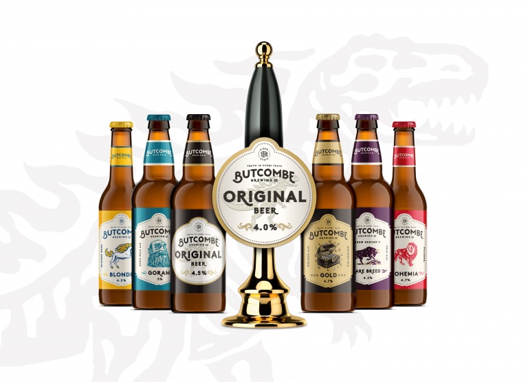
Another day another rebrand. But I’ve got good news for you; it looks like Butcombe Brewery have done a brilliant job! Butcombe have managed to freshen up the range and give it a youthful vibe, but without completely losing its identity. As per, I asked a professional who agreed that this was ‘pretty successful in my opinion; it feels fresh and more characterful, but without straying into cliched craft territory.’
Butcome have also brought out their 78 range; 10 limited edition beers in 330ml cans, each of which has a design linking to an even that occurred in the year the brewery was founded in 1978 (see Space Invaders).
I’m not quite as sure about these although I do like the design concept. The Union hoppy ale looks an awful lot like CTB Hell’s, right? Still, I’m looking forward to giving these a try and I like that they’re reaching out to a different audience, without neglecting their core drinkers.


