

Orbit are three years old. Yes, it’s been three years since Orbit set up shop in their railway arch in Walworth, South East London, and they’ve spent those years producing some solid brews.
But a lot changes in three years, and the evolution of Orbit meant a change was needed. A big change. A change to every tiny bit of branding they had, from the label to the bottle. And this is the result:

What a difference! From well crafted, but admittedly dark labels with no shelf standout to these vibrant pokeballs of loveliness. Anonymous packaging designer (I like to think of her/him as one of those shadowy figures from Crimewatch) agrees: “I think it communicates the musical connection that’s such a big part of Orbit much more clearly than the old packaging, which felt quite busy and recessive. The bottle structure also feels more youthful and cool…but I probably shouldn’t use the word cool.”
To understand Orbit is to understand their commitment to brewing classic styles of European beers, and the deep love of music that runs throughout those beers and plays such an important role in the overall drinking experience.
It is clear then, from these new labels, that alcohol branding agency ByVolume truly took the time to understand Orbit and their ethos. The team explained;
Since we first sat down with the team at Orbit we all agreed that the direction to take was losing some of the visual elements that hindered the key assets.
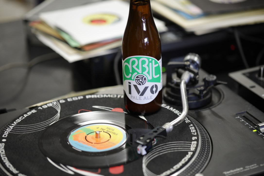
Our focus shifted onto the single word Orbit and the spindle adapter, a strong iconic feature that customers already linked with the brand, and we thought about how they could play together on the label.
We decided to revolve our inspiration around the art of the centre label designs of vinyl singles: the spindle adapter clearly belonged to the hole in the middle, the name Orbit had to dominate the top half as if it was the name of the artist or the record label, leaving the bottom half inform about the different beers and styles like they were songs.
We shaped the lettering Orbit thinking of a soundwave using soft and harmonious dynamics, then added stark contrasts of colour helped by a bold use of white as background. The music geeks may also read a direct reference to the cover art of some German rock and electronic music of the 70s, which is deeply treasured by the members of the team.

But with all that said, I think what I like the most about this new design is its inclusivity. The old labels had so much detail on them, and were so much about the music that they ended up not meaning very much at all. In the new labels the music is very much there; in the names, in the shape, in the representation of the spindle, but I don’t need to know or understand this for the label to remain appealing to me. In other words, it’s not a challenge, and I think that’s okay.

The brewery looks set to continue its increasing success this year, including expanding into the neighbouring railway arch and hiring an additional brewer. Their commitment to independence remains strong, they plan to make more experimental and one off brews than ever before and I for one can’t wait to see what’s in store.
