From the newcomer to the seasoned drinker, it is difficult to deny that a well designed label can influence our decision when it comes to our choice of beverage. Indeed the big brands have invested millions of pounds in design over the years; tweaking a logo, changing a colour and reshaping a bottle in order to appeal to a particular demographic. Traditionally, that demographic has been the younger male, the result being that many of the mainstream beers we know (and sometimes love) have a similar look to them.
This isn’t necessarily a negative factor. After all, these beers are successful household names; they must be doing something right. But what it does highlight is a big beer label shaped design hole that craft breweries have jumped into head first. This might explain their popularity with the young, creative scene and also with female drinkers, so familiar with typically masculine labels such as Stella Artois, Becks and Heineken (and no, if you turn the labels pink it won’t make us want to drink them).
The similarity of big names has certainly worked in the smaller brewery’s favours; you can spot a craft beer from a mile away in a fridge. Take the Six Point cans and Brew Dog’s Punk IPA for example, a shiny silver beacon in a sea of standard at my local Spoons (although I can’t lie, I’m a sucker for an Erdinger Weissbier).
The craft beer ‘revolution’ has brought with it a change in attitude to drinking. We expect more of our beers: we expect a great taste, but more than that, we expect an experience. A exquisitely designed label and/or glass really adds to my overall enjoyment of a beer.
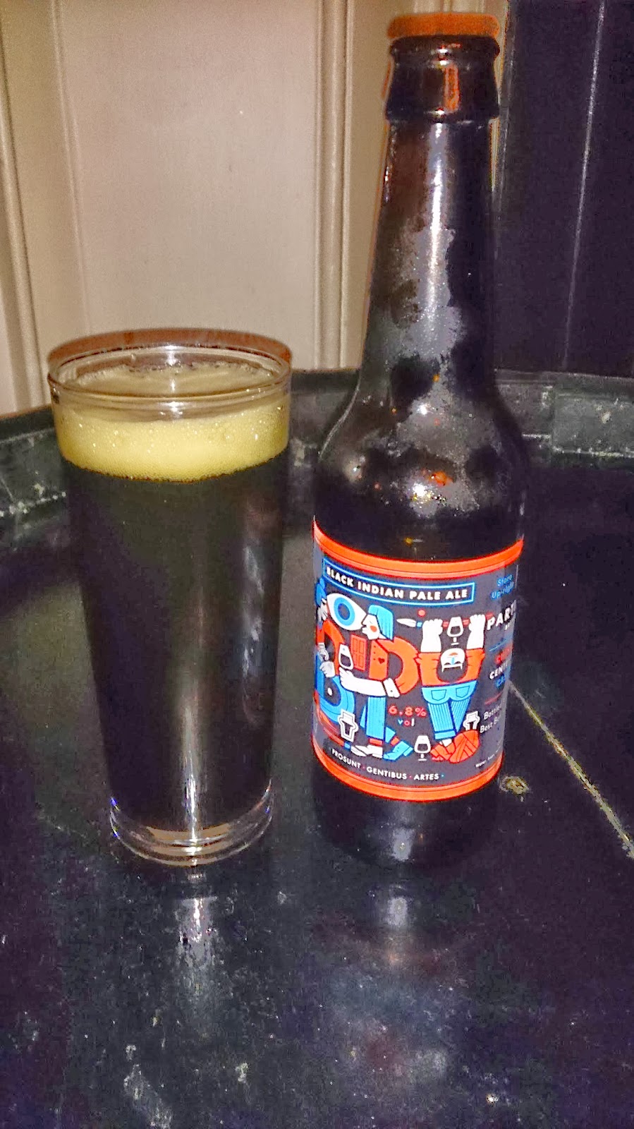
An example of a brewery that does this incredibly well is Partizan. Each Partizan label is a beautiful work of art. So beautiful, in fact, that I would happily frame it and put it up in my house. Each label, designed by Alec Doherty, has figures of people on it with qualities that represent the characteristics of the beer inside. It’s a label that requires a second glance, that provides a talking point and that conveys quality. You might not look at a bottle of Partizan and instantly know what it contains, but you’d certainly want to find out.
It would be impossible to write about beer and design without mentioning the iconic labels created for Flying Dog by Ralph Steadman. A glance at those distinctive illustrations and you know you’re in for a treat. Such is the success and recognisability (yeah, that’s a word now) of those labels that it is alleged some larger companies were ‘inspired’ almost to the point of plagiarism.
But, in the words of Chet Atkins, ‘copying one person is stealing. Copying ten is research.’ And oh how they’re researching! The ‘craft beers’ being released by the big companies clearly stand apart from the rest of their range; perhaps not in taste, but certainly in design.
Craft beer design, to me, has no prescriptive structure and this is what sets it apart from traditional beer design. Designers and illustrators are free to do as they wish; to really tell the story behind the beer and, with that freedom, they’re pushing boundaries and enhancing our experiences.


Where is the shop in the photo??
LikeLike
Where is the shop in the photo??
LikeLike